Quick reports
When using the presentation or document editor to put up your report, you can add one diagram at the time using the spread sheet tool. This can be quite time consuming if you really do not want to make diagrams that differ all that much from some basic diagram types. Catglobe offers you to set up your document or presentation using the quick report tool!
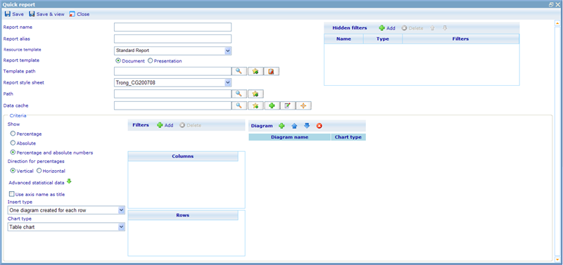
Quick reports can be made from the report list. In many ways it is the same as creating a normal report, where you also create template at the same time. The information you therefore need to specify for the report are:
Report name: A unique name should be given for the report. If you are creating a new document or presentation report then the template will be created at the same time with the same name, so the provided name then needs to be both unique for the report as well as its template!
Report alias: This is the name of the report that will be shown to the viewers of the report. So this should be the name as you want your viewers to see it, where the report name is the name that makes the report easy to identify when administering.
Resource template: You need to choose the resource template type that your report will be created as.
Type: You can choose to create either a document or presentation template for the report. If you choose presentation, each diagram you create will occupy one slide in the final presentation. If you choose document, all the diagrams you add will appear on page 1.
Template path: Since you are creating both a report and report template at the same time, then you must also choose in which path you want to place the template. It is from version 5.5 no longer allowed to place report templates as children of the system resource.
Style sheet: Set the report up to fit the client! To read more on style sheets please click here!
Path: The location you want to place your report!
Data cache: In order to create diagrams for the quick report you need to choose where the data for the diagrams will come from. To learn more on data caches please click here! Notice that there in version 5.5 has been added an additional button ![]() that will make it possible to open and edit the axis set of the chosen data cache directly from the quick report interface.
that will make it possible to open and edit the axis set of the chosen data cache directly from the quick report interface.
Hidden filters: Hidden filters are a new feature from version 5.5 that allows us to show dynamic and static diagrams as well as reports, while filtering all the results based on which group the user belongs to. It is basically an alternative to generating a lot of diagrams/reports each with individual filters. With hidden filters it is possible to do the same with just one instance of a report or a diagram. An example could be that you want to show the gender segregation of the department a user comes from. We can then add one hidden filter for each department (where department is a group where the user is member) and specify a filter that ensures only showing the result from that department, like 'Department==12'. Since we cannot be sure that a user only belongs to one of the specified groups, it is necessary to index the hidden filters. If a user viewing the report or diagram then belongs to more than one of the stated groups, he will only get the diagram/report he is viewing filtered on the highest indexed hidden filter (the one placed highest on the list). If the logged in user does not belong to any of the groups/users of the hidden filter list, then no hidden filter will be applied. Hidden filters are always combined with other types of external filters.
Now that you specified the general information of the report you can start deciding on the diagrams you will add!
The diagram editing area
A number of settings exist in the diagram area; that ensure we can easily generate the diagrams we need.
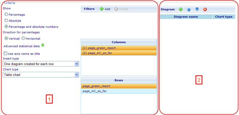
The area consists of two main parts. The 'diagram settings' area [1] and the 'list of diagrams to be generated' area [2].
The diagram settings area specifies the elements of any diagram we want to set up. When clicking on the 'Add' button in area 2 the diagram is add to the list here. We can slowly specify how which diagrams we want and add them to the list in area 2, until we have exactly the diagrams that are needed for the report we are creating. Notice that we can influence the order in which the diagrams are finally inserted to the template using the up and down buttons. If we make diagrams by mistake we can remove them with the 'Delete' button.
Let us now understand how the 'diagram setting' area works!
Show Percentage/Absolute: Depending on the chart type chosen, you will be able to decide whether the results of the diagrams being created are going to be represented as absolutes or percentages; or, when choosing tables, as both!
Direction: Can be used for table, bar and line charts. This setting will decide if columns are set as x- (vertical) or y-axis (horizontal)!
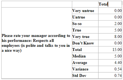
Advanced statistical data: This choice is only available when choosing to show a table diagram type in a vertical direction. What will happen in this situation is that a number of additional rows will be added that shows additional information on the table like Median, Average, Variance and Standard Deviation. These information you will have to choose by expanding this area and selecting the statistical information you want. When not expanded no statistical information is shown.
Use axis name as title: Since axes are automatically created from questionnaires, we may often have axis texts that are long. This could for example be "Please specify what your gender is". If we have ensured that the question labels are more exact, or perhaps we have later redefined the axis names, then we can choose to use these instead of the axis texts. In this example the axis name may well have been "Gender", which will also be a suitable title to show gender statistics. Whether or not you want to choose it depends entirely on how you specify your axis labels. If you are not certain you generally want to leave this value unchecked.
Insert type: When highlighting multiple columns and / or rows the system will not know whether we want a multi-level diagram or one diagram for each chosen column or row. The choice chosen will decide what will happen when we click add. There are three possible choices in this drop down:
One diagram created for each row: You must have chosen at least one row to create a diagram with this setting. Let us imagine you have chosen 2 rows (A and B) and 1 column (C). When clicking add you will create 2 diagrams; a diagram that is a cross between A and C and another that is a cross between B & C. A different situation is if we have chosen 2 rows (A and B) and 2 columns (C and D). If we click add with this type then we will still create two diagrams; a diagram that is a cross between A and C/D (multi-level) and another diagram with a cross between B and C/D (multi-level).
One diagram created for each column: You must have chosen at least one column to create a diagram with this setting. Let us imagine you have chosen 1 row (A) and 2 columns (B and C). When clicking add you will create 2 diagrams; a diagram that is a cross between A and B and another that is a cross between A & C. A different situation is if we have chosen 2 rows (A and B) and 2 columns (C and D). If we click add with this type then we will still create two diagrams; a diagram that is a cross between A/B (multi-level) & C and another diagram with a cross between A/B (multi-level) & D.
A multi-level diagram: When choosing this you will always create just one diagram when clicking add. All the columns you choose will appear multi-level in one direction while all the rows will appear multi-level in another direction. Notice that the system has a restriction of two levels for both rows and columns.
Weight: If the data of your diagram needs to be weighed you can here choose among all the weight type columns of your data cache and axis set. To learn more on making weights for data caches please click here! Notice that this setting is hidden if the axis set of the data cache you are using does not have any weight columns specified.
Filters: If your diagram needs to show data for only a subset of the data material you can here add a general filter. Make a diagram that shows the data for only women.
Columns and rows: The place you choose your data material from. Please read more on the axis set to understand how these data items are created! What you may notice is that when you choose more than one row or column there may be specified a number (1) or (2) in front of the chosen axes. This is for the purpose of multi-level diagrams, where the number specifies which of two chosen axes will be the upper segregation of results, and which will be the lower.


