Setting up brands
"Brand" is the main variable shown for the diagram. For a campaign it is not a brand as such but rather the name of a campaign (mostly marketing) that was run for a certain period of time in e.g. television or magazine. Campaign could e.g. be "Funny Add Week 2-5 for Nestle". The campaign will be shown in a selection box and will be the main choice that users have to make in order to decide on the campaign(s) that the diagram must show results for.
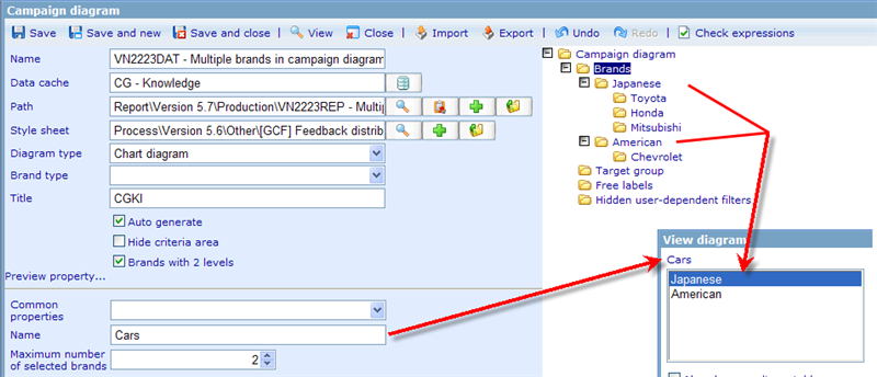
The brands folder can have brands in 1 or 2 levels. What will be shown in the brand control in the viewer will always be level 1 folder names. If we have brands in 1 level then each chosen option in the brand control will result in one series in the diagram. If we have 2 levels then each chosen brand in the brand control will show a number of series equal to the brands in level 2 under the chosen series.
The below example shows how having 2 brands on a 2-level diagram will show in the brand control.
As you will also see above the name of the brand control can also be set by highlighting the root brand folder and defining the name in the detailed view 'Name' field.
The other settings that you can specify on the brand folder is:
Common property: If you have created a common property in the monitor path chosen for this diagram, that specifies a set of brand items (for the applicable diagram type), then you can use this drop down to inherit brand options from that location.
Maximum number of selected brands: This defines the number of 'brands' that a user can max choose at the same time in the brand control.
Let us now see how the detailed brand view area looks for tracking diagrams if we highlight a specific brand under the brand selection branch.
Name: is the name that will be shown in the selection box in the viewer to identify the specific campaign selection.
Set as default choice: makes it possible for us to specify that a certain brand should be selected by default when viewing the dynamic diagram for the first time.
Value: specifies which result will be presented for the given campaign. When the system creates the diagrams it also takes into account all the other filters you may have set and configures your 'values' accordingly. Since value is the most important expression you need to make for any diagram, let us here analyze it in more detail.
A typical expression is here shown: ={count() where like1==[1] } / { count() where like1==[1-99]} *100
Base: is used for free labels, when you want to show what the number of respondents that are included in the analysis in question.
What you can see is that we in the above item want to show the percentage of people who like the item that has the value 1 out of all people that like some item (given that all items exist in range 1 to 100). We then times this value by 100 to get the result in percentages. Generally it makes most sense to show dynamic diagrams as percentages, but it is up to you how you specify your values.
Mean: is used for free labels, when you want to show mean for a campaign in a free label on the chart.
Start week and end week: The period that the specific campaign runs for.
Brands in level 2 are the same as level 1. The only difference is that level 2 brands can inherit values from level 1.


