More actions
Tracking diagram
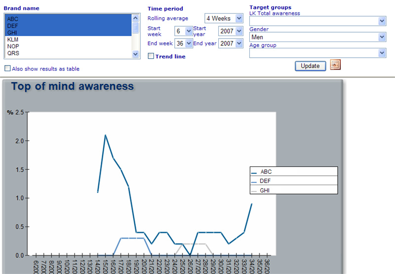
Tracking diagrams display the development of certain key data over a period of time. Currently the tracking diagram supports development analysis by weeks. Below is an example of a tracking diagram:
To view the resulting diagram of the filters set up in the filter area you just need to click the update button. If any of the expressions that are used for generating the image return error, then these will be interpreted as null or zero. If you are not sure of what the actual reason is that a value shows null or zero, there are two hidden update buttons that can help you clarify what lies behind the values you are presented to. These are:
Alt+T: Will show your results with actual error messages in the cells that have problems. (Results will only be shown as table when using thus 'Update' action)
Alt+P: Will show your results as the expressions that will be made to get the final results. (Results will only be shown as table when using thus 'Update' action)
You set up tracking diagrams using the dynamic diagram editor shown below:
To generate a tracking diagram you must/can specify the following information:
Name: A unique name to identify the resource.
Data cache: You must specify where the data for the dynamic diagram is retrieved from.
Title: Will add a title to the diagram image.
Monitor path: If you want to use common properties for the diagram you must here choose the name of the monitor resource to which the diagram should be related!
Style sheet: Important to specify how the diagram will look. Especially important is the style sheet definition for setting up free labels.
Included diagram: It is possible to use the same time period filters to display two tracking diagrams at the same time just under each other. In order to do this you should search for a tracking diagram that has data for similar periods as the one you are setting up!
Name of included diagram: Specify the name that will appear in front of a check box in the viewer. When this check box is chosen the additional diagram will appear!
Auto generate: When checked the user will immediately have a diagram shown when entering the dynamic diagram page. Filters will be the default ones set up for the diagram.
Hide criteria area: When checked then the filter/criteria area where user can specify the logic for the diagram to be shown, will by default be hidden when user enters the viewer of the diagram initially. This setting can only be checked if 'Auto generate' is also set to true.
Brands with 2 levels: Please click here to read more on what brands in two levels mean!
Including a diagram: This text is a bit misleading, but really means that instead of diagram number 2 (from Included Diagram) being shown as an additional diagram, it will instead be included in the primary diagram, but its y-axis will be on the right side.
Pages in category "Tracking diagram"
The following 7 pages are in this category, out of 7 total.


